Portfolio icons have become an essential tool for creatives, freelancers, and professionals who wish to showcase their work in a visually appealing and intuitive way. Icons, which are small graphical representations, can condense information and give your portfolio an edge by enhancing its overall user experience. But how do you use them effectively, and why are they important? This guide will dive deep into the world of portfolio, how they can boost your portfolio, and best practices for their use.
What Are Port folio Icons?
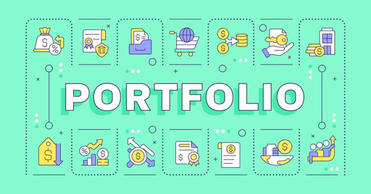
they are small images or symbols used in digital or print portfolios to represent specific skills, projects, or categories of work. They allow the user to navigate your portfolio easily while highlighting particular areas of expertise. These icons can be anything from symbols of design tools like Photoshop to representing different types of projects like websites, logos, or brochures.
The Importance of Icons in a Port folio
Icons help communicate complex ideas quickly. In a portfolio, where the goal is to impress potential clients or employers within a short span, icons serve as visual cues, providing clarity and structure. The use of icons can also add a polished, professional touch, making your portfolio stand out.
How Icons Improve User Experience
Icons create a visual hierarchy and guide the viewer’s attention to key areas. When used correctly, icons make navigation simple, reduce cognitive load, and provide a seamless browsing experience. For example, if someone is looking at your design portfolio, icons can help them identify different types of work (like branding, UX/UI, or illustrations) without reading through lengthy descriptions.
Best Practices for Using Icons in a Portfolio
Keep It Simple
Simplicity is key when using icons in your port folio. Overcomplicating icons with too many details can confuse the viewer. Stick to basic, easily recognizable symbols that communicate the intended message quickly.
Ensure Consistency
The icons you use should have a consistent style. Whether it’s flat design, outline icons, or filled icons, ensure all icons in your port folio follow the same visual theme. This uniformity helps maintain a professional and cohesive appearance.
Use Icons for Specific Categories
Assign icons to categories in your port folio. For example, use a brush icon for illustration work, a camera icon for photography, and a website icon for web development projects. This categorization makes it easier for viewers to navigate through your work.
Pair Icons with Text
While icons are visually helpful, pairing them with short text descriptions is always a good idea. This way, you provide both a visual and textual explanation of what each section of your port folio represents.
Choosing the Right Icons for Your Portfolio
Selecting the right icons is crucial to the success of your portfolio. Icons should be relevant to the content they represent and should not distract from the work you’re showcasing. Use icons that resonate with your personal brand and industry.
Free Resources for Portfolio Icons
Flaticon
One of the largest databases of free and premium icons, Flaticon offers a wide range of icons that can be customized to fit your port folio.
IconFinder
With over 5 million icons, IconFinder is another excellent resource for both free and paid icons. It also provides options to customize icons to your brand’s color scheme.
The Noun Project
Known for its vast collection of high-quality icons, The Noun Project is perfect for those looking to add minimalistic and professional icons to their portfolio.
How to Customize Icons for Your Portfolio
Customizing icons to match your portfolio’s color scheme and style is essential. Many icon platforms allow you to edit the size, color, and background of icons to fit your aesthetic. Tools like Adobe Illustrator or online platforms like Canva can be used to tweak icons as per your brand’s identity.
Avoiding Common Mistakes with Icons
Overloading Your Portfolio with Icons
While icons can enhance your portfolio, using too many can overwhelm the viewer. Balance is key; use icons sparingly to highlight essential sections.
Inconsistent Icon Style
A mix of different icon styles can make your portfolio look unprofessional. Stick to a particular style to maintain consistency across the portfolio.
Using Unrelated Icons
Make sure the icons you choose represent the content accurately. For example, using a book icon to represent photography may confuse the viewer.
The Role of Icons in Mobile-Friendly Portfolios
In today’s mobile-first world, ensuring that your portfolio is mobile-friendly is crucial. Icons play a significant role in making navigation easy on smaller screens. They can replace text-heavy menus and provide a quick, user-friendly way to access different sections of your portfolio.
Integrating Icons into Interactive Portfolios
If you’re aiming for an interactive portfolio, icons can serve as clickable elements that trigger animations, videos, or detailed views of projects. This not only adds functionality but also enhances user engagement, making your portfolio more dynamic.
How Icons Reflect Your Personal Brand
Your portfolio is an extension of your personal brand, and the icons you choose should reflect that. Whether you go for playful, minimalistic, or professional icons, ensure they align with the tone and message of your portfolio.
Examples of Effective Icon Use in Portfolios
Take inspiration from well-designed portfolios that use icons effectively. Look at portfolios from top designers and creatives, observe how they incorporate icons to enhance user experience, and consider how you can apply similar techniques to your own portfolio.
Conclusion
Port folio icons are more than just decorative elements—they’re powerful tools that can elevate your portfolio by making it more user-friendly and visually appealing. When used thoughtfully and strategically, they enhance navigation, clarify content, and contribute to a memorable first impression. By following best practices and customizing icons to fit your brand, you can create a standout portfolio that not only looks great but also communicates your skills effectively.
FAQs
What size should portfolio icons be?
Icons should be small enough to not overshadow your work but large enough to be easily identifiable. A standard size between 24×24 pixels to 64×64 pixels is ideal.
Can I use animated icons in my portfolio?
Yes, animated icons can add a dynamic touch to your portfolio, but use them sparingly to avoid overwhelming the user.
Should I design my own port folio icons?
If you’re a designer, creating custom icons can add a personal touch to your portfolio. Otherwise, free or paid icon resources are excellent options.
How many icons should I use in my portfolio?
Use icons sparingly. Too many icons can clutter your port folio. Focus on using them for categories or to highlight key information.
Where can I find port folio icons?
Websites like Flaticon, IconFinder, and The Noun Project offer a wide range of free and paid icons that can be customized to fit your port folio.